

Поклон кутија
The Art of Gift Boxes: A Thoughtful Expression of Care and Celebration Gift boxes are more than just containers; they are a symbol of thoughtfulness, celebration, and connection. Whether given for birthdays, holidays, weddings, or corporate events, a beautifully designed gift box enhances the experience of both giving and receiving. The right gift box can elevate even the simplest present into a memorable gesture, making the recipient feel truly valued. A well-crafted gift box begins with its design. The exterior often features high-quality materials such as sturdy cardboard, luxurious velvet, or eco-friendly recycled paper. Some boxes are adorned with elegant patterns, embossed details, or metallic foiling to create a sense of sophistication. The color palette plays a crucial role—soft pastels convey warmth and tenderness, while bold hues like deep red or gold evoke excitement and grandeur. The unboxing experience is carefully considered, with magnetic closures, ribbon ties, or satin linings adding a touch of elegance. Inside, the arrangement of items is just as important. Thoughtful organization ensures that each component is presented beautifully. Many gift boxes include layers of tissue paper, custom inserts, or compartments to keep items secure and visually appealing. Some feature personalized notes or engraved messages, adding an extra layer of sentiment. The contents can range from gourmet treats and fine chocolates to skincare sets, candles, or curated collections tailored to the recipient’s interests. Sustainability has also become a key focus in gift box design. Many brands now use biodegradable, reusable, or recyclable materials to minimize environmental impact. Wooden boxes, fabric wraps, and plantable seed paper are popular eco-conscious alternatives that still deliver a luxurious feel. Ultimately, a gift box is a reflection of care and attention to detail. It transforms an ordinary exchange into a meaningful moment, leaving a lasting impression. Whether simple or extravagant, the perfect gift box speaks volumes, conveying emotions that words alone cannot express.
производ
Класификација:
-
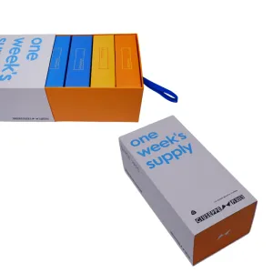
Џорџ Вајт кутија за паковање
категорија: Other product packaging boxesПогледи: 1034серијски број:ослобађање време: 2025-09-23 09:32:49Паковање овог производа има класичну правоугаону структуру призме са чистим линијама и добро дефинисаном формом. Не само да максимизира ефикасност простора за практичан транспорт и складиштење, већ и преноси стабилан, професионални визуелни утисак. Целокупна стратегија боја је усредсређена на чисту белу, која се широко примењује да би се створио светао, уредан и модеран тон који симболизује професионализам и поузданост. У дну кутије, суптилни наранџасти акценат је вешто интегрисан. Ова жива, топла нијанса ствара упечатљив, али хармоничан контраст са доминантном белом. Разбија потенцијалну монотонију једнотонске палете док минималистичком дизајну даје приступачност и енергију, наговештавајући проактиван и иновативни дух бренда у оквиру његовог професионалног домена. Визуелна фокусна тачка на предњој плочи је јасно одштампан плави текст „једнонедељна залиха“. Ова фраза, која дословно значи „једнонедељна залиха“, веома је функционална, омогућавајући потрошачима да одмах разумеју циклус употребе и капацитет производа. Избор плаве боје преноси смиреност и рационалност; упарен са белом позадином, делује изузетно јасно и читљиво, у потпуности отелотворујући основни принцип дизајна једноставности и приоритета функционалне комуникације. Ова директна испорука информација ефикасно смањује когнитивни напор за потрошаче и побољшава употребљивост. Информације о бренду су концентрисане на бочном панелу кутије. Овде је назив бренда „ГИУСЕППЕ 乔治白“ јасно одштампан и на кинеском и на енглеском, обезбеђујући прецизно препознавање бренда и међународну привлачност. Истовремено, слоган „ВОДЕЋИ БРЕНД У УНИФОРМИ” самоуверено потврђује лидерство бренда у сектору униформи, преносећи професионални кредибилитет и снагу бренда купцима. Штавише, графички лого бренда је представљен уз текстуалне елементе, заједно чинећи комплетан и стандардизован систем идентитета бренда. Техника рељефне штампе која се користи на овој кутији за паковање је кључна за њену побољшану текстуру. Овај процес користи прецизно израђене калупе за стварање издигнутих, текстурираних ефеката рељефа на подлози. Примењен на логотип бренда или кључне елементе текста, ствара тактилне, тродимензионалне шаре кроз варијације сенки под светлом — чак и без мастила. Ово тактилно искуство подиже паковање изнад равности, дајући суптилан, префињен занатски квалитет. Надовезујући се на минимализам, постиже префињеност у детаљима. Укратко, овај дизајн паковања успешно отелотворује принцип „форма прати функцију“. Избегавајући сувишне орнаментике, постиже чисту, ефикасну естетику кроз структуриране форме, смеле контрасте боја, једноставну типографију и рељефне текстуре. Прецизно преноси основне информације о производу и професионално позиционирање бренда, савршено у складу са чистом, функционалном естетиком потребном за пословне и униформне секторе. Док испуњава основне заштитне функције, суптилно приказује посвећеност бренда квалитету кроз промишљене детаље. -
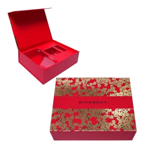
GIVENCHY Packaging Box
категорија: Other product packaging boxesПогледи: 986серијски број:ослобађање време: 2025-09-23 09:32:58The packaging box for this product employs a sophisticated combination of two printing techniques: matte lamination and foil stamping, which together create its exceptional texture and visual appeal. First, the entire box surface is covered with a layer of delicate matte film. This process not only significantly enhances the packaging's durability, providing practical functions like scratch resistance and fingerprint resistance, but more importantly, it imparts a soft, understated matte finish to the surface. This texture feels warm and smooth to the touch, reminiscent of the fine fabrics used in high-end bespoke clothing. It instantly establishes an understated luxury tone for the packaging, avoiding the cheapness often associated with glossy finishes while showcasing a refined and sophisticated aesthetic. Against this matte foundation, the design incorporates dazzling hot foil stamping. The box body features a rich, authentic red—a symbol of passion and good fortune that also conveys classic nobility. Complementing this red are meticulously designed golden floral patterns. These patterns are not merely printed but achieved through precise hot foil stamping, where metallic foil adheres firmly to the box surface, creating dazzlingly luminous, sharply defined three-dimensional motifs. The pairing of red and gold represents a timeless combination in color aesthetics—the former steady and fiery, the latter brilliant and opulent. Together, they form a striking yet harmonious visual contrast, significantly enhancing the packaging's sense of luxury and artistic impact, making it unforgettable at first glance. The box's layout design is particularly refined. At the visual center, a red decorative ribbon pattern runs through, a design element cleverly inspired by the ribbon styling of high-end gift boxes, adding layers of depth and a sense of ceremony. Above the ribbon, the brand name is clearly printed in black. The choice of black is masterfully executed. As the most substantial neutral color, it appears exceptionally steady and striking against the red-gold backdrop. This effectively enhances brand recognition while avoiding the visual clutter that other colors might introduce, ensuring the overall aesthetic remains pure and sophisticated. Overall, the packaging design achieves a perfect balance between strength and softness, tradition and modernity. The floral motif serves as the crowning touch—its delicate lines and romantic forms infuse the premium aesthetic with a touch of grace and warmth, preventing an overly rigid or formal appearance. This allows the packaging to exude luxury while maintaining an emotionally engaging appeal. This refined and elegant design language, from the understated texture of the matte film to the dazzling brilliance of the foil stamping, and the classic color combination of red, gold, and black, sees every detail thoughtfully considered to collectively create an outstanding visual impact. More than just a packaging vessel, it serves as an extension of the brand's identity, perfectly aligning with its inherent fashion and luxury DNA. This design successfully reinforces the brand's premium and refined image in consumers' minds.


вести
Класификација:
Још нема резултата претраге!
случај
Класификација:
Још нема резултата претраге!
видео
Класификација:
Још нема резултата претраге!
преузимање
Класификација:
Још нема резултата претраге!
регрутовање
Класификација:
Још нема резултата претраге!
Препоручени производи
-
NEWS
Џорџ Вајт кутија за паковање
Сазнајте више -
NEWS
GIVENCHY Packaging Box
Сазнајте више


 Телефон