

Решења за малопродајно паковање
Retail Packaging Solutions: Enhancing Product Appeal and Sustainability Retail packaging plays a crucial role in product presentation, protection, and brand communication. Effective packaging solutions not only safeguard products during transit but also influence consumer purchasing decisions by enhancing shelf appeal and conveying brand values. In today’s competitive market, retailers and brands must balance functionality, aesthetics, and sustainability to meet evolving consumer expectations. Key Functions of Retail Packaging 1. Product Protection – Packaging must ensure products arrive intact, preventing damage from handling, shipping, or environmental factors. Durable materials like corrugated cardboard, rigid plastics, or cushioned inserts are commonly used for fragile items. 2. Brand Identity & Shelf Appeal – Visually striking packaging attracts attention and differentiates products. Custom designs, vibrant colors, and clear typography help communicate brand messaging. Minimalist or luxury finishes (e.g., matte coatings, embossing) can elevate perceived value. 3. Consumer Convenience – Easy-to-open features (resealable zippers, tear strips) and ergonomic designs improve user experience. Portability and compact sizing are critical for on-the-go consumers. 4. Information Delivery – Packaging must display essential details like ingredients, usage instructions, and regulatory compliance. QR codes or augmented reality (AR) integrations can provide additional digital engagement. Sustainability in Retail Packaging With growing environmental awareness, brands are adopting eco-friendly solutions: - Material Choices: Recyclable, biodegradable, or compostable materials (e.g., paperboard, plant-based plastics) reduce waste. - Minimalist Design: Lightweight packaging lowers shipping costs and carbon footprints. - Reusable Systems: Refillable containers or returnable packaging programs encourage circular economies. - Ink & Printing: Soy-based inks and water-based coatings minimize chemical use. Innovations & Trends - Smart Packaging: NFC tags or temperature-sensitive labels enhance functionality. - Personalization: Limited-edition designs or customized packaging foster consumer loyalty. - E-commerce Optimization: Durable, right-sized packaging reduces returns and shipping waste. Conclusion Retail packaging is a dynamic blend of practicality and creativity. By prioritizing sustainability, innovation, and consumer needs, brands can create packaging that protects products, delights customers, and supports environmental goals. The future of packaging lies in smart, adaptable solutions that align with both market demands and planetary health.
производ
Класификација:
-
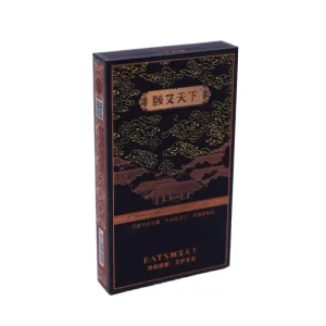
И И ТИ пресс паковање цигарета
категорија: Cigarette boxПогледи: 949серијски број:ослобађање време: 2025-09-28 09:32:32Овај производ са мирисом пелине, назван „Ии Аи Тиан Ксиа“, садржи паковање које представља ремек-дело које спаја традиционалну естетику са модерном занатском вештином. Од укупног визуелног утицаја до детаљних детаља, сваки аспект одражава дизајнерово дубоко разумевање класичне елеганције и бескомпромисну тежњу за квалитетом. Паковање има доминантну, дубоку црну нијансу—симбол безвременске елеганције која успоставља ненаметљив, загонетан тон за производ. Ова дубока црна није равна, монотона завршна обрада, већ открива суптилне текстурне варијације под одређеним осветљењем, дочаравајући спокојно ноћно небо и пружајући идеалну позадину за декоративне елементе који следе. Златни и браон акценти раштркани по дизајну служе као његов крунски додир. Бриљантно злато, оличење племенитости и сјаја, наноси се жигосање фолијом како би се оцртале контуре и истакле фокусне тачке. Топла браон, евоцира рустикални шарм и природну елеганцију, испуњава одређене шаре или функционише као комплементарне акцентне траке. Оба се савршено усклађују са црном базом, заједно стварајући елегантно, луксузно и безвременско визуелно искуство, као да дестилирају миленијуме културног наслеђа у један квадратни инч. Преко површине кутије, сложени облаци се непрекидно таласају, испуњавајући цело видно поље. У традиционалној кинеској култури, мотиви облака симболизују повољност, успон и испуњење жеља. Њихове течне, коврџаве линије не само да додају осећај покрета композицији, већ и суптилно одражавају слику дима тамјана који се нежно и лежерно диже, вешто резонирајући са суштином производа. Осим шара облака, дизајнер генијално уграђује елементе древне архитектуре - можда преврнуте стрехе павиљона и кула, или китњасте обрисе резбарених греда и обојених прозорских оквира. Ови архитектонски симболи носе историјско памћење, додатно побољшавајући класичну елеганцију амбалаже. Они преносе гледаоца кроз време, евоцирајући свечаност и спокој древних палата. Што се тиче техника штампања, кутија за паковање користи комбинацију УВ сито штампе, топлог штанцања фолијом и ламинације тактилног филма, значајно побољшавајући и тактилно и визуелно богатство. УВ сито штампа постиже високу засићеност боја са суптилном подигнутом текстуром, чинећи шаре облака и древне архитектонске мотиве тродимензионалним и живописнијим. Вруће штанцање ствара заслепљујуће светле златне акценте са глатким, луксузним осећајем, значајно подижући врхунску привлачност производа. Коначно, текстурирани филмски премаз даје површини кутије мекоћу налик на кожу. За разлику од стандардних сјајних или мат завршних обрада, ово јединствено тактилно искуство пружа топао осећај пријатан за кожу, омогућавајући корисницима да одмах примете његов изузетан квалитет приликом руковања. Све у свему, дизајн паковања мокса тамјана „Ии Аи Тиан Ксиа” успешно спаја традиционалну естетику са савременим сензибилитетом. Он превазилази пуку функционалност као контејнер, развијајући се у уметничко дело. Кроз прецизну интеграцију боја, шара и занатства, евоцира дубоки класични културни амбијент. Визуелно слојевит са дубоком културном резонанцијом, савршено преноси инхерентне вредности производа природе, здравља и наслеђа, чинећи га веома препознатљивим и привлачним међу упоредивим понудама. -

Jie Jiu Ling Brand Pressed Candy Packaging Box
категорија: Other product packaging boxesПогледи: 1022серијски број:ослобађање време: 2025-09-28 14:16:00This packaging for the “Jie Jiu Ling” brand compressed candy is a design masterpiece that seamlessly blends traditional aesthetics with modern craftsmanship. The overall design features a deep black as its primary color—a deliberate choice that not only establishes a dignified and sophisticated tone but also visually conveys an air of mystery and premium quality, subtly hinting at the time-honored wellness wisdom behind the product. Particularly ingenious is the designer's integration of dazzling gold accents along the box's edges, corners, and key functional areas. This black-and-gold color scheme creates a striking yet harmonious visual contrast. The gold instantly breaks the black's tranquility, like stars in the night sky, significantly elevating the packaging's luxurious aura and visual depth. At first glance, one immediately senses its exceptional quality. The front of the box serves as the visual focal point, dominated by a meticulously designed gold panel that forms the core display area for brand information. The typography is meticulously arranged, exuding a sense of orderly precision. The chosen font style is classic and elegant, its strokes seemingly bearing traces of history. This design language subtly echoes the product's core concept of “originating from traditional ancient formulas,” silently conveying trustworthiness and professionalism to consumers. Upon closer inspection of the black base, the design's ingenuity becomes apparent: subtly printed botanical patterns appear faintly. These delicate, understated motifs do not overpower the composition but infuse the overall design with a touch of natural elegance and a profoundly mysterious atmosphere—perhaps metaphorically hinting at the natural and precious nature of the herbal ingredients used in the product. The base of the packaging is equally meticulously designed. A relatively subdued gold section clearly displays essential information such as product specifications, ingredients, and production details, supplemented by concise, intuitive icons for visual clarification. This approach ensures accurate and readable information delivery, embodying modern design's functional demands. It allows the packaging to retain its practical value while being steeped in traditional connotations. The most remarkable aspect of the entire packaging lies in its exquisite printing techniques. UV screen printing lends the gold graphics exceptional color saturation and gloss, with a smooth, refined texture. Embossing is likely applied to the subtle botanical patterns, imparting a delicate tactile dimension through its raised and recessed textures. while embossing or debossing likely enhances the brand logo and key text, creating a three-dimensional relief effect that further amplifies visual impact and premium appeal. In summary, this packaging box masterfully balances classical elegance with modern technological sophistication. It transcends mere functionality as a container, evolving into a work of art. Through the integrated application of color, graphics, typography, and cutting-edge craftsmanship, it precisely crafts the brand's image of refinement, professionalism, and cultural depth, delivering a visually captivating, premium experience for consumers.


вести
Класификација:
Још нема резултата претраге!
случај
Класификација:
Још нема резултата претраге!
видео
Класификација:
Још нема резултата претраге!
преузимање
Класификација:
Још нема резултата претраге!
регрутовање
Класификација:
Још нема резултата претраге!
Препоручени производи
-
NEWS
Jie Jiu Ling Brand Pressed Candy Packaging Box
Сазнајте више


 Телефон